
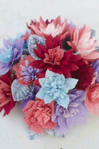
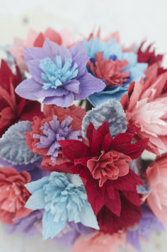
Last spring, I picked up some fabulous crepe paper colors at a shop in the Bay Area. The rolls have been sitting in a pile on my shelves ever since, and finally this week I pulled them down and did some experimenting with the new paper.
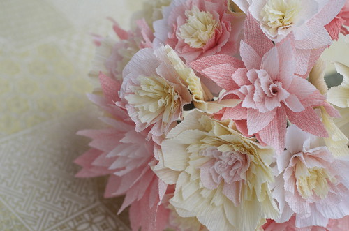
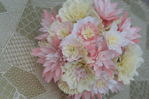
One of the rolls was an ombre that bleeds from a pale cream to a rich pink. I loved having a large range of tones to work with - it makes more dimensional and realistic blooms.
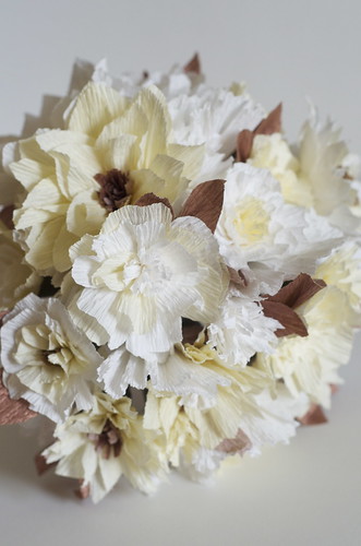
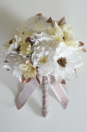
I picked up a few metallics too, which I love for leaf accents and flower centers.
I found a few bold colors, too. I don't get much of a chance to work with stronger colors, as most brides I work with prefer more timeless, neutral tones. I do love playing with color,
2014 brides, what are your thoughts on color? Have you decided on your palette yet?
Neutrals? Pastels? Bolds? Monochromatic? Tone-on-tone? High contrast?
I would love to hear what you're thinking!
1 comment:
I'm going with neutrals mixed with some pale pink accents for my April wedding.
Post a Comment